Link
A colorful, lively daily newspaper aimed at reluctant newspaper readers
1 | 14
Client
Landmark Communications, circa 2005-2007
My Role
- Founder
- Design Director
- Branding
- Prototypes
- Content Strategy
- Visual Design
- Typography
- Logo Design
How might we …
- Reach an audience alienated by traditional newspapers
- Bring some color, fun and innovation to a stodgy and cautious business
- Capture advertisers who might not otherwise be interested in or afford newspaper advertising.
- Generate passionate readers, not just eyeballs, but fans – loyalists.
Unique Challenges
No. 1 | Starting a print publication from scratch
Newspapers are complicated to make. They are essentially a manufactured product that is made on a daily basis. Among them:
- Building library items and templates in the the front-end production system
- End-to-end testing of the production to printing process
- Print-run prototyping
- Finding, interviewing and hiring a talented and diverse staff, who all had to relocate
- Setting up an office
- Establishing a routine, ramping up staff and hitting a daily deadline
No. 2 | Reaching a difficult-to-reach demographic
Understand the market
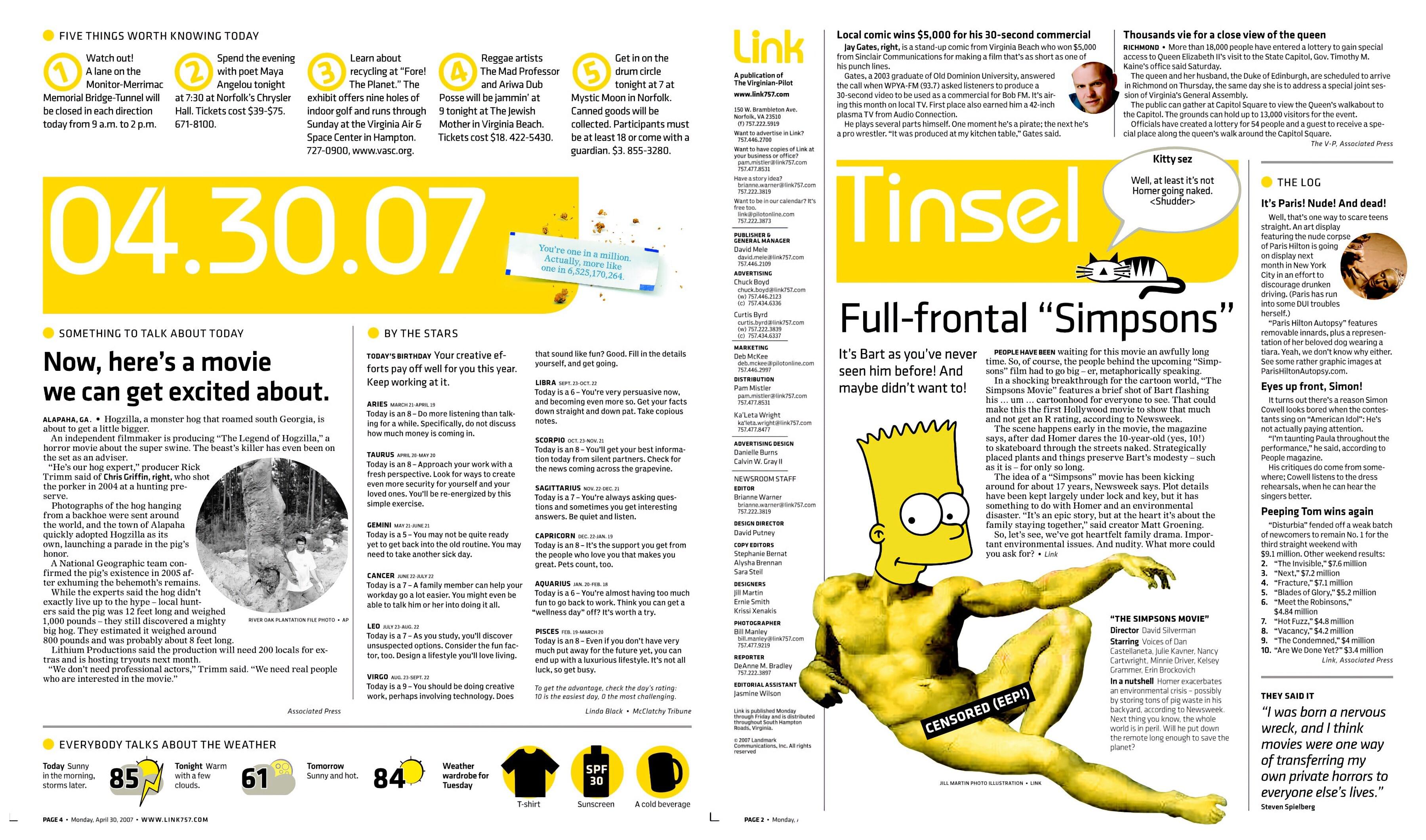
So we did something that newspapers rarely if ever did: Talk to people and listen to their input. We did extensive research – type that might be considered normal these days – into what the target market was into. We did a competitive survey – but not of newspapers. We looked at magazines, websites and alternative sources.
Prototype and iterate
We did multiple prototypes, including one that was printed on a large format printer glued together with a glue stick and held together with binder clips for user testing. What we found was that the user experience of newspapers – headline, photo, story written in the most boring way possible – was fundamentally flawed with this group. The readers we wanted didn’t want that.
Target content
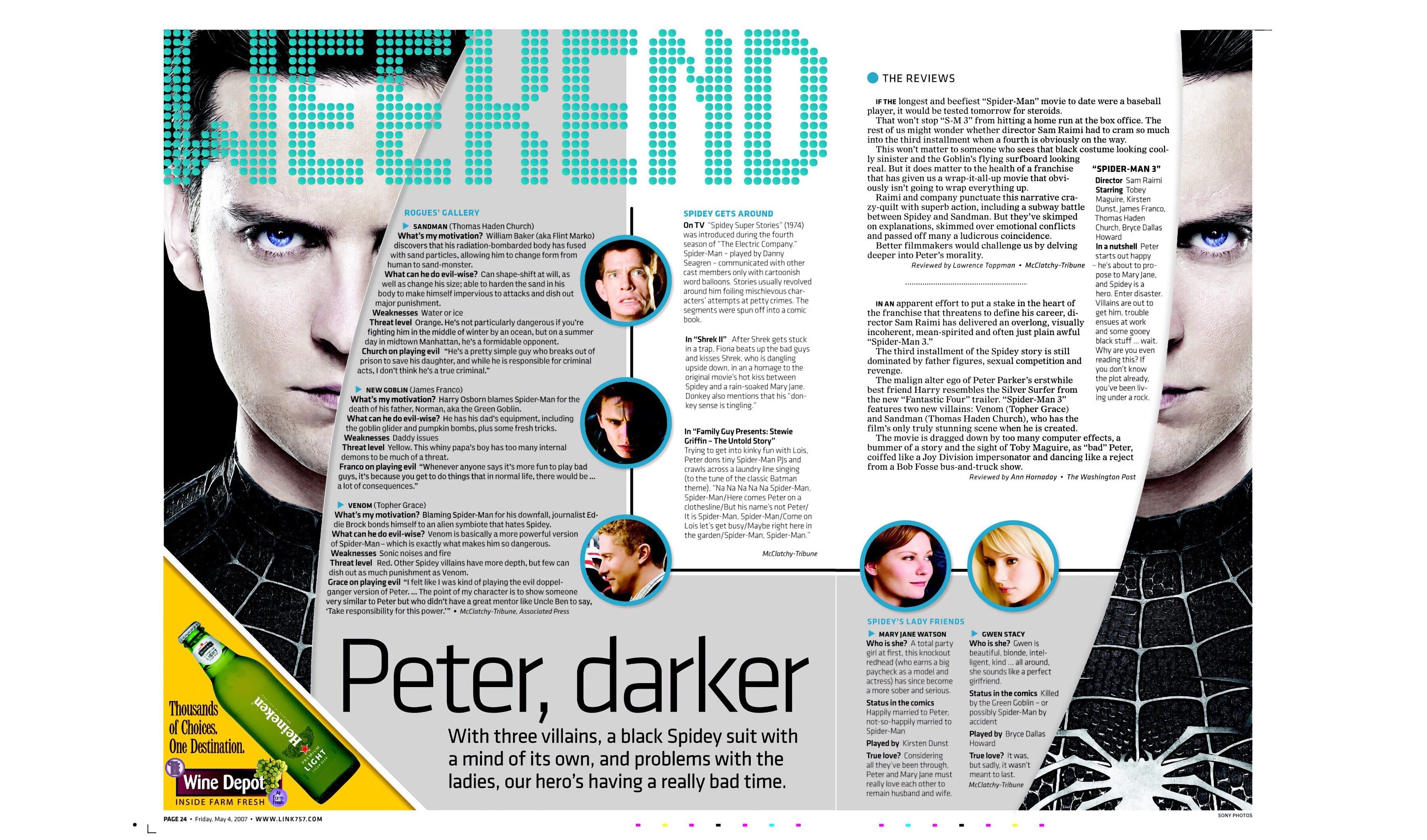
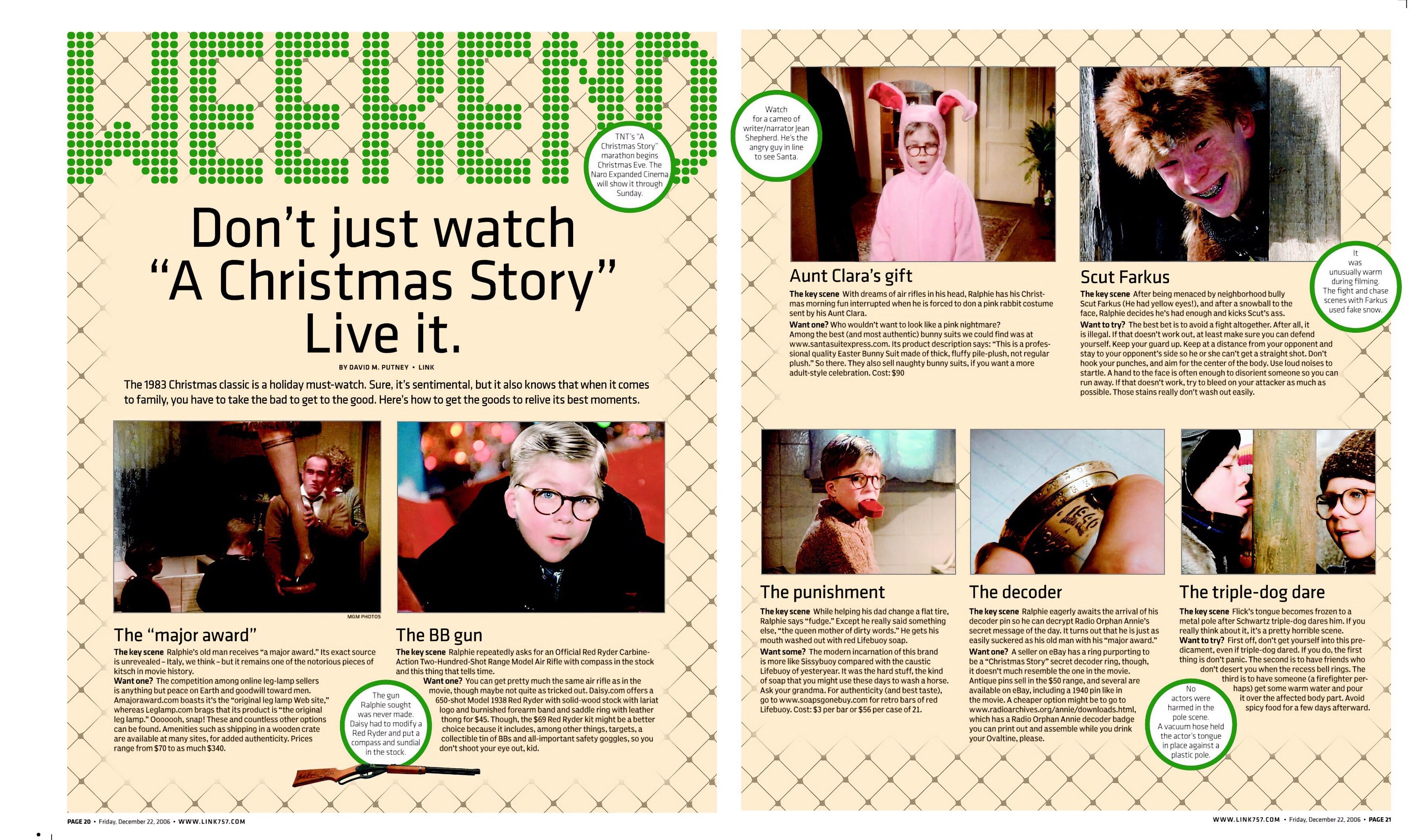
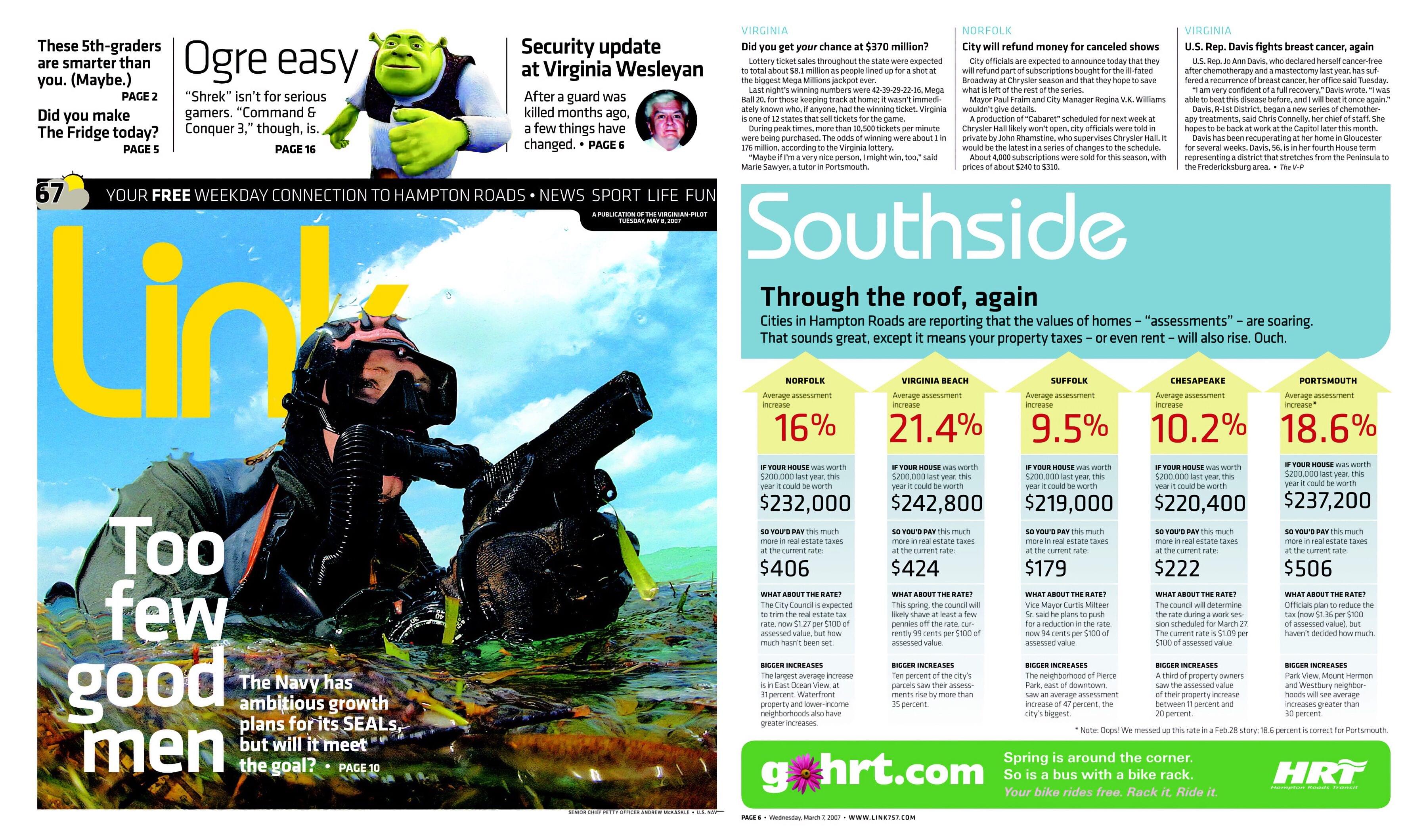
We found that readers actually wanted:
- Brevity
- Lists
- Facts
- Color
- Imagery
- Data Visualizations
- Integration of photo, copy and design
No. 3 | Creating a fresh brand in an industry damaged by decades of stasis
In the news business, your content is your brand. So Link needed to emphatically not be what had come before.
The core Link group did a brand exercise, and landed on several keywords. Among them: “genuine,” “lively” and “active.” Being cool wasn’t our aim. We didn’t want to be Poochie the Dog. Editorial voice was far more key to success than design alone. We focused on how it spoke as well as what it spoke about. Link was:
- Conversational – Written in normal language and not “newspaper speak.”
- Excited – Tell stories we are excited to share with readers. If we can’t be excited about them, how can readers?
- Explain, don’t tell – Stories were informed by the key parameters of what happened, what it means and what’s next.
- Active stories – Readers should be able to not just read, but go and do – concerts, crafts, get-togethers, etc.
- Solve problems for readers – Life-hack type stories would take precedence, such has health, home, cooking and lifestyle.
No. 4 | Setting a world-class standard with a limited staff
Link was meant to be small and scrappy – just 8-10 people – but with large ambitions as a design-forward organization. As such, we had to do much with a small staff.
- Versatile staff – designers wrote and writers designed, not to squeeze out more work but to let people’s creativity go where it led them.
- Design days – everyone got a day off daily pages to work on a longer-term, more complex project.
- Ownership – people could pitch it, design it and see it go to print
Page 3 of 4