This is why we can’t have nice things
Saturday, July 2, 2016
Four-minute read
“Doesn’t someone here still use this?”
The Slack message linked to an article on The Verge. Facebook was announcing it would kill its app Paper at the end of July.1
It wasn’t much of a surprise, even for a Paper bitter-ender like me. The Facebook division that made Paper disbanded long ago, and Paper hadn’t been updated in months. The app’s news aggregator / reader functions have become less of a priority for Facebook.
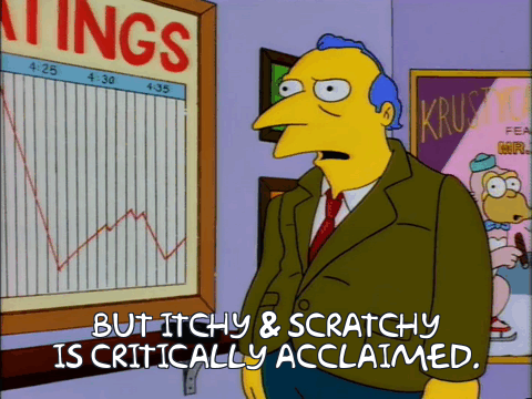
Mourning an app that so clearly failed in the marketplace might seem pointless. But Paper was quite simply the best designed app available for any mobile platform. This all ends up sounding a bit like The Simpsons episode in which an executive, confronted with declining ratings, exclaims “But Itchy & Scratchy are critically acclaimed.”
Likewise, Daring Fireball’s John Gruber summed Paper up as a beautiful app wasted on Facebook.2 And it is indeed beautiful.
One way that Paper stood apart was that app interactions were largely gesture-based.
News feed entries appeared in a vertical row across the bottom. To read one, swipe up. To scroll entries, swipe sideways. To post, swipe down. To pan an image, tilt the phone from left to right.
With a swipe up, linked articles unfolded elegantly like a piece of paper. A swipe down folded them away and brought a user back to the timeline. Even the text entry field for posts, while just a text field, still felt more polished than any other app.
Every one of those gestures was beautifully fluid with extreme attention to detail. The app had a lightness – a floaty, airy feeling, almost – when swiping about, compared with the poke / tap / scroll of most apps. It was design in the pure “how it works” sense, executed in a way that feels like that’s exactly how it should work.
It felt good – really good, actually – to use. I have apps that I value for what they let me accomplish, but Paper was the only one that I valued for the way it felt while it did them.
The UX designer in me looks at something like Paper and thinks “This is way better! Why aren’t you people using this?”
Paper had a fatal flaw somewhere inside all beautifully polished magic. People already had a Facebook app that did what they needed, albeit much less elegantly. Paper just wasn’t different enough for most people to go the trouble of learning its interactions.
“It’s Facebook, but better!” was never going to cut it. Dislodging established habit for something unfamiliar takes a big lever.
And here lies the dark irony. Anyone who adopted Paper and stuck with it clearly had greater-than-usual determination and zeal for the app. Like the TV show Firefly or the Apple Newton or SAAB, Paper gained just enough loyal, die-hard fans to fail miserably.
But the real shame of Paper’s failure is that the app should have pointed to something better. The iPhone’s user-interface paradigms were a leap ahead in that they translated desktop actions – click on a thing, scroll a thing, resize a thing, type a thing – into direct manipulation of onscreen objects via touchscreen.
Paper built on these ideas and took them further than any other app. It was multitouch native, built for a multitouch-only world. It was of the iPhone, not just on an iPhone.
We see bits of Paper in apps like Tinder’s “swipe right, swipe left” but Paper’s ambition and core ideas haven’t really been emulated. To draw the lesson that people don’t want beauty and elegance and aesthetics and all that pretentious designery stuff would be a mistake. An app should be beautiful and useful.
And that was Paper. Credit to Facebook for making it. They just didn’t know what to do with it once they had it.
- The end is officially July 29, but my timeline on Paper has stopped updating. I just poke at the app forlornly now.
- I disagree with this. It was the ambition and vision of Facebook that made the app. Where’s the Apple or Google app with this kind of fluid, elegant interactions?
- I remain doubtful of newsreader apps like Flipbook and Apple News. They have their users, but I suspect that they are fundamentally not the way the most people want to read news.